

Every website owner wants to be ranked top of Google. There’s a ton of work needed to be put into your SEO to get there but it’s a worthwhile investment of time, effort and money. There’s a sea of free traffic waiting to flow into your website, but before this we have a gatekeeper to please. Google.
Publishing quality content, building relevant links, optimising pages and a wide range of other tasks that go into ranking your website can give you the best chances of success to rank top of Google. Search engines want what’s best for their visitors, so it’s your job to give them the best content and experience.
However, if the foundations of your website design aren’t setup correctly, you could be destined to sink to the depth’s of Google’s page results aka Sundar Pichai’s Locker (Google CEO).

I have put together a list of website design factors that can negatively effect your search engine rankings. I don’t want to leave you out at sea with a leaky website, so I’ve included the best practices to rectify the design issues your website could be holding you back with.
Let’s have a look!
Bad website design increase bounce rate and lowers engagement rate
Your bounce rate (now being replaced with engagement rate) is the % of visitors that do nothing on your website and jump ship to somewhere better, such as your competitors website. Your job is to keep visitors on your website by making it as engaging as possible.
Google is looking out for this statistic and will sink your website to the depth’s of the SERPS if they’re finding out your website isn’t helping people.
Google Analytics has started to replace bounce rate with engagement rate, but whichever statistic you see here’s what you should know…
If your bounce rate is high, that’s bad for your website.
If your engagement rate is high, that’s good for your website.
Google are replacing bounce rate with engagement rate as it’s a fairer and more accurate statistic. It calculates metrics such as time on page, views and conversion rate. Whereas bounce rate increase even if a user spent 60+ seconds reading your page and left your website.
However, they’re both important statistics for your website and they’re metrics that should be worked on immediately if the numbers aren’t great. After all, it’s all about making sure you’re helping your visitors by making your website useful to them so these statistics matter.
There can be a lot of variables that can change the bounce rate however, such as quality of traffic – you might just be targeting the wrong visitor to your page. This will require a bit more digging through analytics and checking different traffic sources to see if this is the case. For example, your bounce rate could be much lower for a better quality source of traffic.
However, if you’re finding overall your website has a high bounce rate then it will most likely be down to bad web design, poor user experience or irrelevant information that’s low quality.

You need to make your website incredibly easy to use so visitors can navigate through it without much thinking or searching. It also needs an engaging design that lures the visitor in to find out more about your business or content.
A poor website design will put off a large percentage of visitors, as your website can appear untrustworthy and unprofessional which will also change the perception of your business.
It can also ruin the readability and user experience of your website, which is the most important factor to get right. Google wants their visitors to have great website experiences and will value those in the rankings.
There are a lot of web design flaws that can increase your bounce/engagement rate and I will explain them now.
Slow Website Speed
Building modern websites is all about speed. There is no excuse for a slow website in 2022 and visitors won’t be forgiving either. Neither will Google, who always seems to be siding with the impatient and judgmental visitors.
They do however want what’s best for your visitors, as they’re essentially a customer of their search engine. We all want what’s best for our customers so you can’t blame Google for choosing the fastest and most useful website for their searchers.
Google chooses well-designed websites with the best user experience when content is tough for Google to decide who goes top.
“While page experience is important, Google still seeks to rank pages with the best information overall, even if the page experience is subpar. Great page experience doesn’t override having great page content. However, in cases where there are many pages that may be similar in relevance, page experience can be much more important for visibility in Search.“
– Understanding page experience in Google Search results
Put your website URL into Google Page Speed Insights tool and see what your rating is. You should be aiming for the green, especially for mobile. Mobile has taken over desktop searches (60%), so Google has prioritised mobile first websites in their search results. We’ll get into this further along the article, but in terms of website speed – make sure your mobile speed is up to par as desktop is generally easier to achieve a higher score.

Google Page Speed will also make recommendations tailored to your website, in which they prioritise in terms of importance. Start with the high priority tasks and you’ll have the biggest wins reclaiming your page speed score.

Image optimisation is always a great start as they can bloat your page size which will result in a longer load time. Make your images smaller in file size by reducing the quality of them or resize their dimensions to fit your website. Doing both is highly recommended as it can dramatically reduce loading time on your page.
There are a range of image optimisation tools such as ShortPixel, TinyPNG and Smush Plugin if you’re using WordPress.
Your bounce rate/engagement rate will also increase as visitors won’t wait around for a page to load. Infact, 53% of visitors will leave a webpage if it doesn’t load within 3 seconds, as researched by Google. Every second counts when it comes to loading times.
Don’t let your visitors jump ship before they can experience your website, get your website up to speed. Your visitors and Google will love you for it.
Page Structure for SEO
Your website structure also matters, which is what your website visitors can’t see aesthetically. If it’s poorly designed and not structured correctly, then it can be detrimental to your SEO efforts.
You need to structure your pages efficiently for search engines to be able to read and understand the topic.
For example, every page should have a single H1 tag that includes tells the visitor and Google the main topic of the page.
This tells Google what your page is about and is very important that it’s on every page of your website. Each page needs a unique H1 tag or search engines will get confused and damage your rankings.
You should then use H2, H3, H4, H5 and H6 tags as you write sub-headings. Choose your tags in order of importance.
For example:
<h1>Window Fitter in Chester</h1>
<h2>Double Glazing Window Installation</h2>
<h3>Book a window fitter</h3>
Your header tags should be built into all of your pages. It allows search engines to understand what your entire page is about, making it easier to get your pages indexed. It also helps pick up different keywords and phrases that relate to the topic that you’ve chosen to write about.
Having different headers down your page also splits up your content allowing users to scan through your website, so they can find what they’re looking for quicker.
Keep your H1 tags at the top of your pages before you start the rest of your content. It should be your main headline which always sits at the top of a web page.

This seems a bit more of a technical issue (which it is) but it should be taken into consideration when designing your website. Since the H1 is always at the top, your main headline should use this and then H2 for the sub-headline below and so on.
Build it into your design and be consistent on all your pages using the framework as a template. Good SEO practices built into good design will take your website further.
Mobile Optimised
As mentioned in the speed section of the article, mobile is now prioritised by Google over desktop. This means your website now has to work flawlessly on mobile.
60% of all Google searches are now carried out on mobile devices. This is why Google have made it a must that your website is mobile friendly. Don’t forget it’s Google’s job to help their visitors have the best experience on the web, so if your website isn’t working for mobile then it won’t be shown at the top of the Google results.
If your website isn’t responsive to mobile, which means it doesn’t adapt to mobile screen sizes – then I would seriously consider a new website immediately. It will be holding your business back as it will be unusable for up to 60% of visitors and search engines will sink you for it.
Infact, Google have included this into their web core vitals, where they will grade you on the mobile friendliness of your website. This can have an impact on your websites ranking so run it through Google’s tool to find out.

Poor Aesthetic Design
Poor aesthetic design can have a huge impact on your website. It can dramatically damage your bounce rate/engagement rate if visitors are finding your website difficult engage with your content. This is usually down to bad design principles.
38% of visitors will stop engaging with a website if the content or layout is unattractive. (Blue Corona)
This could range from a poor choice of colours, font or text sizes which can all impact the readability of the website. Or even too many images that clutter the website and distracts the user from your content.
Your website needs to be clear, easy to read and engaging.
It also needs to look presentable and feel trustworthy. Look at the top websites in your industry and you’ll see a beautiful website that’s branded and laid out clearly. This is what makes a great website experience.
Large businesses invest into high quality design for their website because they have seen the impact it has through their numbers.

When it comes to ranking, even Google’s John Mueller suggests that the visual presentation of a website can impact its visibility in search results.
“Sometimes those small differences do play a role in regards to how people perceive your website. If, for example, you have something that is on a financial topic and people come to you and say “well your information is okay but it’s presented in a way that looks very amateurish,” — then that could reflect how your website is perceived. And in the long run could reflect something that is visible in search as well.”
– John Mueller (Google Search Advocate)
You can see this in action too. Just search a keyword into Google, check out the page 1 results and compare them to page 10. There’s a night and day difference in design and overall user experience.
Images
Want your visitors to stick around?
Make sure your images are highly engaging and relevant to your content. You should use them to break up your textural content or it can end up being a wall of text that your readers won’t feel motivated or interested in reading.
Images are incredibly important to website design and you should choose the highest quality available. They have a big role in the design of your website and they liven up your content to make it engaging.
This can sky rocket your engagement rate as visitors will want to stick around and spend time consuming your content if they’re enjoying what they see visually.
Choose your images carefully though, you want to pick ones that match the topic that you’re writing about so that your visitors can connect with it. You can also use it to convey emotion, such as a customers smiling using your product.
Using images of people on your website is proven to boost trust – it’s always good to see a face behind a website especially if it’s one of your team or an original your company have taken.
However, websites laced in stock images can have the opposite effect, so make sure you’re choosing your images that look authentic and that they belong to your brand.

Fosters Family Funeral Directors have done a superb job of using photograph of people to make their website look friendly and trustworthy. It’s engaging and gives the website an uplift seeing welcoming smiles which isn’t expected on a funeral directors website.
They’ve used a clever use of imagery that sets them apart from other funeral directors. It’s no wonder they’re ranking so well on Google for the search term for ‘funeral directors’.
Optimise every image you include on your website too.
Include keywords that describe the image into your file name and include alt text. This makes your images accessible to screen readers, which Google cares about as they want your website to be user-friendly for everyone.
Having alt text and an optimised image is proven to help your website rankings. Your images can also rank on Google Image Search, which can help increase your traffic to your website.
Alt text and file names that are keyword friendly will help your images rank, which will be pointing back to your website giving you a traffic boost.
Colours
Your colour palette should be limited to 3.
You should have a primary, secondary and accent colour throughout your website. This gives your website a consistent and branded feel that your visitors will appreciate and it gives them a good first impression of your website.
It also helps with digesting your content. Too much colour can be distracting and can hurt the the time they spend on your website. Choose colours that are readable, easy on the eye and match the theme of your website.

You wouldn’t stay on a funeral directors website that was designed in pink and rainbow colours, so choose your colours wisely and make sure it appeals to your visitors.
If you really want to use a bright colour on your website, use this as your accent colour and keep your text dark so that it’s clear to read. Dark grey text on a white background is always a winner when it comes to readability.
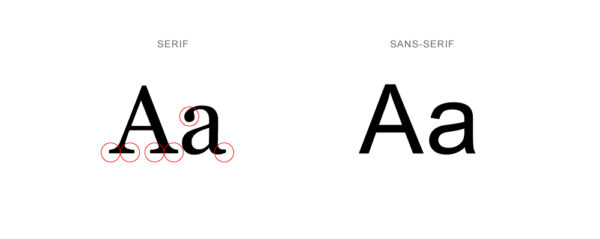
Fonts
Readability and usability has priority over aesthetics. Your font sizes need to be clear and easy to read. There will be visitors with poor eye sight that look at your website, so cater for those too. You need be inclusive to everyone.
Choose fonts such as serif and sans serif fonts that are simplistic. Don’t get carried away with fancy fonts that you personally like, because your visitors won’t have the same appreciation.
Imagine how embarrassed you’d feel if you found out your visitor chose to do business with your competitor because they hated your font and couldn’t read it easily? Google can do the same too and rank your competitor above you.
Readability over design, always!
Engaging Content & Layout
Users don’t read, they scan. Most of the content on your website won’t be read by your visitors, but your headlines will. Make sure you format your website in a way that’s easy for your users to digest. Make the most important pieces of information stand out through bitesized headlines.
Spacing is your friend when designing your website. Make sure you’re adding gaps between your content and splitting it up into different sections. Breaking up blocks of content with spacing, headlines and images is going to allow your visitors to soak up your content like a sponge.
You can also split your content into columns with a mix of headline, text and imagery. This gives your visitor the best chance of consuming your content as you’ve laid it out into appetising bitesized chunks of content.

Make your content easy to consume with a layout that’s clear and you’ll have a visitor that sticks around to enjoy what your website has to offer.
Google appreciates a good website design as suggested by John Mueller who is Google’s Search Advocate, so it’s worth taking your website design serious.
It would be a shame to put all your efforts into writing world-class content but your website design holds you back from the rankings you deserve.
User Experience
How easy is your website to use? You need to make it a breeze to use and you shouldn’t make your users think. Help the user gets from point A to be B smoothly, without having to rummage around or think about how to get there.
Google needs a good user experience for their users, so it’s your job to make your website tick these boxes.
You may also see a pattern emerging throughout this article by now, which is making everything easy, simple and clear for your visitors. It really does make an impact on your website overall.
It’s easy to over do your website in terms of design and trying to make it unique, but this can hurt your user experience and ultimately your rankings.
Stick to design principles that you’re used to seeing among popular websites and don’t reinvent the wheel. There’s a reason websites stick to a similar universal format so stick to it. Your visitors are used to this and changing things will confuse them where they could end up having a frustrating experience with your website and brand.
Let’s have a look at the main principles to get right for smooth sailing site experience.
Easy Navigation
When your visitors land on your website, they are in the unknown. They don’t know where anything is and where to find it, so you need to guide them.
Make your website easy to navigate with a clear and simplistic menu that uses design queues to help them identify it.
The universal website menu is a logo to the left and your most important page links to the right. Use this and don’t stray too far from the original layout. Visitors are familiar with this layout and will be confused if yours is different.
Amazon and Apple use exactly the same format and they are the largest companies in the world. They understand that this is the most efficient menu structure and changing it around would lose them money.


Take indirect advice from them and keep your menu the same so you don’t lose money, visitors and rankings. It’s a must that your website is made easy to navigate and caters for everyone, including elderly people that may not be as tech savvy as the general population.
Google have been open about user experience being a ranking factor, so make sure you get this right to give your site the best chance of rankings.
Call to actions
What do you want your user to do when they’re on your website? Every page needs a focused goal. One thing that you want your user to do and nothing else.
It could be reading more of your content, purchasing a product or enquiring about a service.
Make the page focused on that singular action or run the risk of the visitor leaving without doing anything on your website.
Having call to actions towards the top of your website, that are bold and clear will increase the chances your visitor takes the next step. You need your CTA’s to stand out off the page and be enticing enough for them to take action.
Use buttons that contrast well from the rest of the colours of the page and make it large and bold. This way you can attract attention to it and make that click happen.
This will also reduce the bounce rate of your website and also be beneficial to your conversions – which is good for business!

Website Architecture
Your site structure needs to be carefully planned out so that users can find what they want as easy as possible. Help them find what they’re looking for in as few clicks as possible.
Not only does it help user experience but it also helps search engines to understand your content and rank it higher on the results page.
Google’s search engine crawls your website and needs to find new pages and changes easily. Having the right structure in place helps the search engine do it’s job efficiently for your website.
As a rule of thumb, all pages of your website should be 3 clicks away from your websites homepage.
Here’s an example of creating a well planned out website structure:

You can see the categories, sub pages and articles all stem from the homepage. The web pages all link up together and users can find what they’re looking for within 3 clicks from the homepage.
One mistake that can hurt rankings is having rogue pages that cannot be accessed from any other of your pages. These will be difficult for Google to crawl.
Having your website linked together effectively and strategically will boost SEO benefits. This is called internal linking, and it helps search engines understand your site structure and the topical connection between the pages.
It helps pass link authority from pages that’s doing well in the SERPS with good authority and helps the other pages get a ranking boost that are linked to it.
It’s a bit like a well connected pipeline flowing with authority rather than water. Link all the pipes together and it will flow across the entire system.
Take a lot of time and consideration into planning your page structure. Getting it right from the start will save losing rankings further down the line when you need to change the structure as the website grows.
Think ahead and always look for the most simplistic sitemap. Octopus.do is a brilliant tool for planning your websites page structure.
SSL Encryption & HTTPS
All website owners should know what an SSL certificate is and a HTTPS enabled website, but it’s worth adding in as it could be missed. You could have been on an 8 year internet detox and only just connected to the world again. Or you’re just too focused on your business you haven’t got time to look into the technical details of a website (more likely this).
Your website needs to have an SSL certificate so that your website uses HTTPS which is secure. Otherwise, your website will not be secure as it will be HTTP (not HTTPS) and Google will penalise your website for it. Since 2014 Google has made HTTPS a ranking signal since it’s important visitors are kept secure when browsing your website.
I assume that 99% of website owners reading this have an SSL certificate by now, but some mistakes can be made when designing the website even if you have one.
You could be linking content to a http link rather than https which can make your website ‘unsecure’. This can be easily done and it’s well worth checking through your website to see if you’re not making that fatal mistake.
This is called ‘mixed content’ and it can make your visitors vulnerable to attacks whilst browsing your page. In 2018, Google also started to warn visitors that your site is not secure which directly affects the credibility of your website and leads to a high percentage of visitors leaving immediately.
I’ve seen many websites sunken to the depths of the search engines for having unsecure http websites. Google take it seriously as it protects their users.
“Security is a top priority for Google.”
– Google, HTTPS as a ranking signal
Good website design helps Google rank your website in the SERPS
If you’ve made it to the end of this SERP saving article (hurray!), you can see all the ways Google can penalise a websites ranking if design is not good enough.
But you can also see how to correct these and how good website design can work for your website.
Google have said that website design and user experience is a ranking factor and it can be favoured in the search results.
They have also mentioned that if you do see a drop in rankings and can’t piece together why your website has been penalised, it could very well be to do with your websites design and layout.
A general reduction in traffic, which is not related to any specific algorithm update, may indicate there’s an issue with the website’s quality.
The design of a website could be holding it back in search rankings, Mueller suggests, if it doesn’t meet users’ quality expectations.
John Mueller, Google – Search Engine Journal
The design of a website could be holding it back in search rankings, Mueller suggests, if it doesn’t meet users’ quality expectations.
Use this article to compare your website to, and see which elements could be improved to help your website rank higher. I have tried to point you in the right direction with some helpful tips and examples so you can use this as a guide.
Let’s get your website sailing up the search engine rankings as smoothly as possible, with a beautiful well-designed vessel to take you there.
Bon Voyage!


